

 Posted by
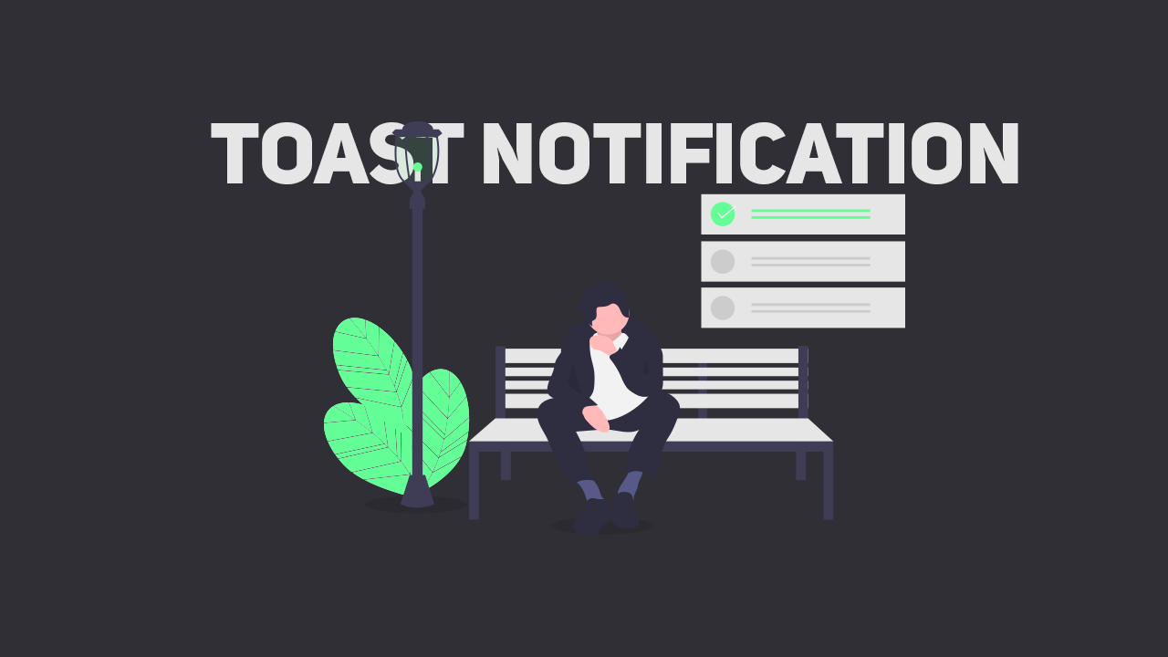
Live Preview
I use some material to design this alert box. The material makes it easy to design the alert box. See the below materials list I use in this design:
- Font Awesome 5 - www.w3schools.com/icons/fontawesome5_intro.asp
- jQuery 3.4.1 - code.jquery.com
- Poppins Font - https://fonts.googleapis.com/css?family=Poppins
<html lang="en" dir="ltr">
  <head>
    <meta charset="utf-8">
    <title>toast notification</title>
    <script src="https://kit.fontawesome.com/a076d05399.js"></script>
    <script src="https://code.jquery.com/jquery-3.4.1.js"></script>
  </head>
  <body>
    <button>Show Alert</button>
    <div class="alert hide">
        <span class="fas fa-exclamation-circle"></span>
        <span class="msg">Warning: This is a warning alert!</span>
        <div class="close-btn">
          <span class="fas fa-times"></span>
        </div>
</div>
<script>
    $('button').click(function(){
      $('.alert').addClass("show");
      $('.alert').removeClass("hide");
      $('.alert').addClass("showAlert");
      setTimeout(function(){
        $('.alert').removeClass("show");
        $('.alert').addClass("hide");
      },5000);
    });
    $('.close-btn').click(function(){
      $('.alert').removeClass("show");
      $('.alert').addClass("hide");
    });
  </script>
  </body>
</html>@import url('https://fonts.googleapis.com/css?family=Poppins:400,500,600,700&display=swap');
*{
margin: 0;
padding: 0;
user-select: none;
box-sizing: border-box;
font-family: 'Poppins', sans-serif;
}
html,body{
height: 100%;
}
body{
display: grid;
place-items: center;
overflow: hidden;
}
button{
padding: 8px 16px;
font-size: 25px;
font-weight: 500;
border-radius: 4px;
border: none;
outline: none;
background: #00e868;
color: white;
letter-spacing: 1px;
cursor: pointer;
}
.alert{
background: #8fffc1;
padding: 20px 40px;
min-width: 420px;
position: absolute;
right: 0;
top: 10px;
border-radius: 4px;
border-left: 8px solid #ccffe3;
overflow: hidden;
opacity: 0;
pointer-events: none;
}
.alert.showAlert{
opacity: 1;
pointer-events: auto;
}
.alert.show{
animation: show_slide 1s ease forwards;
}
@keyframes show_slide {
0%{
transform: translateX(100%);
}
40%{
transform: translateX(-10%);
}
80%{
transform: translateX(0%);
}
100%{
transform: translateX(-10px);
}
}
.alert.hide{
animation: hide_slide 1s ease forwards;
}
@keyframes hide_slide {
0%{
transform: translateX(-10px);
}
40%{
transform: translateX(0%);
}
80%{
transform: translateX(-10%);
}
100%{
transform: translateX(100%);
}
}
.alert .fa-exclamation-circle{
position: absolute;
left: 20px;
top: 50%;
transform: translateY(-50%);
color: #fff;
font-size: 30px;
}
.alert .msg{
padding: 0 20px;
font-size: 18px;
color: #fff;
}
.alert .close-btn{
position: absolute;
right: 0px;
top: 50%;
transform: translateY(-50%);
background: #00ff73;
padding: 20px 18px;
cursor: pointer;
}
.alert .close-btn:hover{
background: #01803a;
}
.alert .close-btn .fas{
color: #fff;
font-size: 22px;
line-height: 40px;
}
comment 0 Comments
more_vert